
This week, Patti – hostess of Lens-Artists Photo Challenge #220 – challenges us to look at one subject three ways.


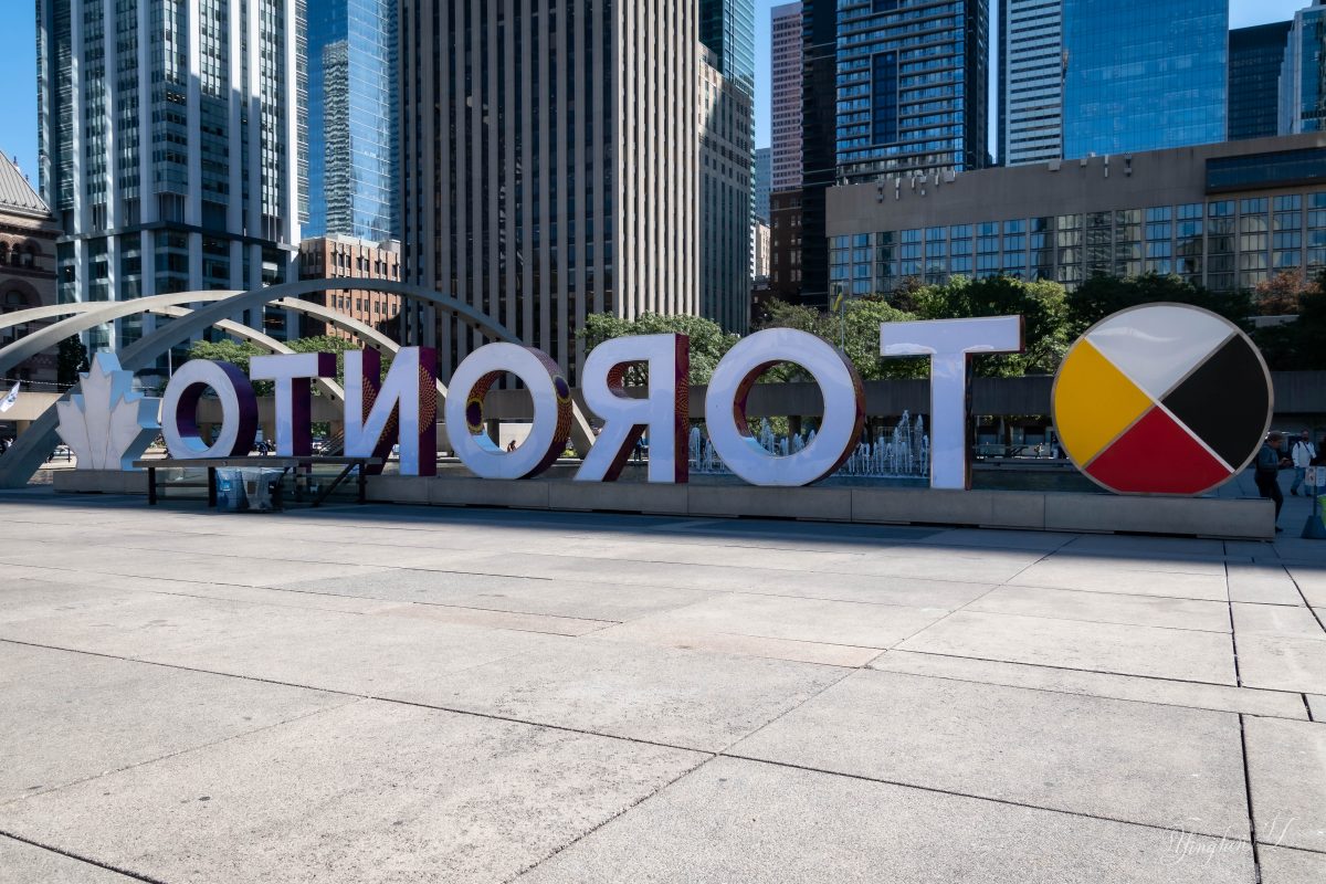
My first choice for this challenge is the Toronto sign. I had quite a difficult time taking a photo of the sign from the front as there was always people loitering around the area. So I figured I would take a photo from each angle and see which looked best.
I am not sure I have a favorite view for this one. Do you?
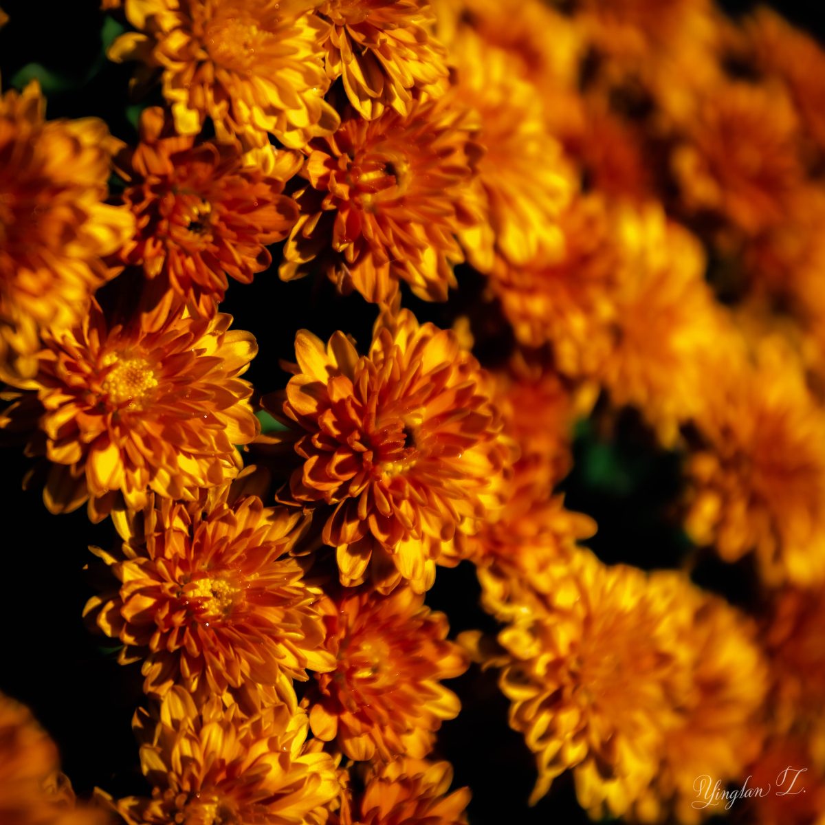
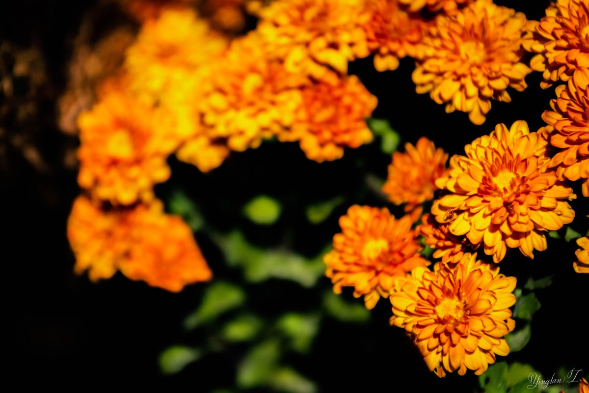
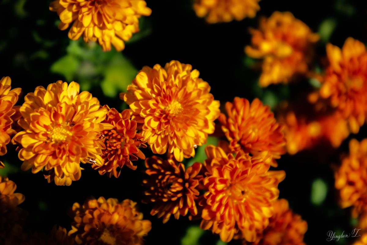
If there is one color I hate to photograph, it’d be orange.
Upon coming home from my 2-week trip, I found my mums blooming in my backyard. I planted these mums last fall and pruned them all the way to the ground in the winter. They came back this year with a vengeance. Plants tend to do that when you trim them to the ground.
Anyway, I planted 5 different colors of mum – dark red, pink, orange, yellow, and white. This is the first year the orange mum bloomed. There were barely any blooms last year by the time I planted it in the ground. I love this color but it doesn’t feel very photogenic. With the sun beating down on them, they looked washed out and over-exposed. It took quite a bit of editing to tone it down.
Therefore, I must photograph them at different angles to see which worked best. These three photos are that of a side view (left), front view (top right), and top view (bottom right). I am liking the side view the best.

These are the white mums, planted next to the orange mums. I took this photos minutes before taking the photos of the orange mums. You can see they’re not as bright as the orange.

Those oranges are beautiful! I agree with you–the first sideview of the mums is my favorite. I’m glad you joined us this week!
LikeLiked by 1 person
Thank you. 🙂
LikeLiked by 1 person
Beautiful photos Yinglan
LikeLiked by 1 person
Thank you.
LikeLiked by 1 person
My pleasure
LikeLiked by 1 person
Baie mooi! Pronounced :buy a Moy. Means Very beautiful in Afrikaans.
LikeLiked by 1 person
Thank you. 🙂
LikeLike
Excellent. LOVE the Toronto sign. Definitely 3 angles!
LikeLiked by 1 person
Thank you.
LikeLiked by 1 person
For some reason you site won’t let me on… why don’t you like photographing orange? For me, in digital, it’s green which always looks electric.
LikeLiked by 1 person
Hmm… that’s weird. I sure hope my website is not being blocked because yesterday was an exceptionally slow day (traffic-wise) and I had wondered whether something was wrong.
I don’t hate photographing all things orange, just flowers. I find orange, yellow, and red flowers particularly tricky to photograph because they always seem to be overexposed in the sun while look quite dark, gloomy, and colorless under cloudy skies.
Oh yeah, I agree, green is another color and I recently found myself playing with the color grading feature in Lightroom and adding a tiny bit of blue shadow to make the green not so green.
LikeLike
Don’t forget, you can overexpose in the gloom and underexpose in the bright sun. I’m old so I speak in 1/3s of a stop. But, 1/3 of a stop in either direction should do it. Ever since the dawn of digital photography green has been a problem. You’ve discovered a press printing trick. Blue creates density which calms down nuclear green. Black creates contrast which is what you don’t want to do with green.
I don’t think your site is blocked. I see your posts. It may just have been a glitch.
LikeLiked by 1 person
Ah, I always forget to adjust this setting. I think I sometimes over-emphasize on setting adjustments prior to pressing the shutter button while other times, I feel I’m not emphasizing enough on that. I really need to find a good middle ground.
LikeLike
Here’s the middle ground I think. Adjust the setting in the camera when you photograph one subject in consistent light.
LikeLiked by 1 person
Excellent – and I love orange! My favourite is the Toronto take – well done!
LikeLiked by 1 person
Thank you.
LikeLike
Looks so amazingly wonderful 🙂
LikeLiked by 1 person
Thank you.
LikeLiked by 1 person